
Introduction: Your Website Should Do More Than Look Good
A lead generation website can have an attractive design, modern animations, professional photography, technically impressive development, and still fail without website conversion optimization. That happens because good-looking design and conversion-focused design are not the same thing.
A visually impressive website may support website conversion optimization by telling visitors who the company is, what it offers, and how long it has been operating, but that does not necessarily answer the questions that influence a buying decision:
- Is this relevant to me?
- Can I trust this company?
- Does it solve my specific problem?
- Why should I choose it?
- What should I do next?
A conversion focused website design addresses these questions deliberately. Every major component, from the headline and page structure to navigation, forms, testimonials, pricing information, CTAs, page speed, and mobile experience, is designed around a measurable business objective.
That objective could be:
- generating qualified enquiries
- booking consultations
- requesting quotations
- generating calls
- completing purchases
- requesting demos
- submitting applications
- downloading valuable resources
The goal isn’t to make every visitor convert through conversion focused website design. The goal is to make it easier for the right visitor to understand the offer, trust the business, overcome objections, and take the next appropriate action.
What Is Conversion Focused Website Design?
Conversion focused website design is an approach to designing and developing websites around measurable user actions rather than aesthetics alone. Traditional website design may begin with: “How should this website look?”
A conversion website design approach begins with: “What do we want the visitor to do, and what does the visitor need to believe before taking that action?” That changes how the entire conversion focused website design is planned.
For example:
- a B2B website may have the primary conversion goal: Book a Consultation
- while a SaaS company may prioritize: Start Free Trial
- and an ecommerce website may prioritize: Add to Cart → Checkout
The design, content, navigation, technical implementation, and measurement system should support those objectives. A conversion focused website design approach keeps each element aligned with the visitor’s intended action.
Conversion-Focused Design vs Traditional Website Design
A traditional website design for conversions can be organized around the company’s internal structure.
For example:
- About Us
- Services
- Products
- Team
- Blog
- Contact
A website design for conversions is organized more around the user’s decision process.
The visitor needs to understand:
- What problem does this company solve?
- Is the solution relevant to me?
- Why should I trust the company?
- How does the process work?
- What results or outcomes can I expect?
- What does it cost or how does engagement work?
- What should I do next?
This doesn’t mean conventional pages aren’t useful. It means each page should have a purpose within the conversion journey.
The Conversion Funnel Behind a High-Converting Website
A website should be viewed as part of a broader funnel.
Traffic
↓
Landing Page
↓
Attention
↓
Relevance
↓
Understanding
↓
Trust
↓
Objection Handling
↓
CTA
↓
Conversion
↓
Lead Qualification
↓
Customer
The Problems are:
- If the website generates traffic but visitors don’t understand the offer, the problem is messaging.
- If visitors understand the offer but don’t trust the company, the problem may be credibility.
- If they trust the business but don’t know what to do next, the problem may be CTA design.
- If they click the CTA but abandon the form, the problem may be friction.
This funnel-based thinking is central to website design for conversions.
Start With Conversion Goals Before Designing the Website
The first step isn’t choosing colours, fonts, animations, or layouts. It is defining what a successful conversion means. Different businesses require different conversion goals.
B2B Company
Primary:
- enquiry
- consultation
- demo request
- quotation request
Secondary:
- brochure download
- case study download
- contact form
Ecommerce
Primary:
- purchase
Secondary:
- add to cart
- wishlist
- account registration
Professional Services
Primary:
- consultation
- appointment
- enquiry
SaaS
Primary:
- free trial
- demo
Secondary:
- product tour
- signup
Without clearly defined goals, designers often optimize for visual quality rather than commercial outcomes.
Primary vs Secondary Conversions
Not every conversion needs to be a sale. A visitor may not be ready to speak with your sales team on their first visit. That’s why websites can use both primary and secondary conversion actions.
For example:
- Primary CTA: “Book a Strategy Consultation”
- Secondary CTA: “Download the B2B SEO Guide”
The secondary action provides value to visitors who aren’t ready to buy. This can help lead conversion by creating a relationship rather than forcing every visitor toward a sales form.
Understand Who Is Actually Visiting the Website
A website redesign cannot be conversion-focused without understanding its users. Different visitors may arrive with completely different expectations.
For a software development company, visitors could include:
- founders
- CTOs
- IT managers
- procurement teams
- enterprise technology teams
Each may have different questions.
A founder might care about:
- cost
- speed
- business outcomes
A CTO may care about:
- architecture
- security
- scalability
- integrations
Procurement may care about:
- pricing
- contracts
- compliance
- delivery process
A high converting website should account for these different decision-making factors.
Buyer Personas Are Not Enough
A common mistake is creating generic personas such as: “Business Owner, age 35–50.” That isn’t particularly useful for conversion design.
More useful questions are:
- What problem brought this visitor here?
- What alternatives are they considering?
- What information do they need before contacting us?
- What objections might stop them?
- What evidence would increase confidence?
- What would make them leave the website?
These insights should influence content and page structure.
Build the Value Proposition Above the Fold
The first screen of conversion website design has an important job.
It should quickly communicate: What you do + Who you help + Why it matters + What to do next
A weak headline might say: “Welcome to Our Digital Solutions Company.” It provides almost no meaningful information. A stronger proposition might communicate: Enterprise Web Development for Scalable Digital Platforms
followed by: Design, develop, integrate, and optimize enterprise websites built around performance, security, and long-term growth.
Then the visitor receives a clear next action: Talk to an Enterprise Web Specialist
The objective is clarity.
Design for the Visitor’s Problem, Not the Company’s History
One of the most common website mistakes is starting with the company.
For example: “Founded in 2008, XYZ Technologies has grown into a leading provider…” The website redesign visitor may not care yet. They first want to know: Can you solve my problem?
Company history becomes more persuasive after relevance has been established.
A conversion-oriented page therefore typically introduces:
- Problem
- Solution
- Benefit
- Proof
- Process
- CTA
A website redesign can then support trust.
Use Benefit-Led Messaging
Features describe what a company provides. Benefits explain why the customer should care.
For example:
- Feature: “24/7 website monitoring.”
- Benefit: “Identify critical website issues before they become major business disruptions.”
Another example:
- Feature: “Enterprise API integration.”
- Benefit: “Connect your website with CRM, ERP, and business systems without forcing teams to manage disconnected data.”
High converting websites make the business outcome obvious.
Make the CTA Clear and Specific
CTA design is one of the most visible elements of conversion website design.
Weak CTAs include:
- Submit
- Click Here
- Learn More
- Enquire
These don’t explain what happens next.
Better CTAs communicate the action and value:
- Book a Free Consultation
- Get a Project Estimate
- Request a Custom Proposal
- Schedule a Demo
- Speak With an Expert
- Get Your SEO Audit
CTA optimization depends on the user’s intent and level of buying readiness.
CTA Hierarchy
A page should usually have one dominant conversion objective.
For example:
- Primary CTA: Request a Consultation
- Secondary CTA: View Case Studies
- Low-Friction CTA: Explore Our Process
This CTA optimization prevents the page from becoming a collection of equally prominent buttons. If everything is emphasized, nothing is emphasized.
Reduce Conversion Friction
Every additional obstacle can create an opportunity for abandonment.
Friction can come from:
- long forms
- unnecessary fields
- unclear instructions
- forced registration
- slow pages
- confusing navigation
- unexpected popups
- unclear pricing
- poor mobile design
For a simple consultation request, asking for:
- Name
- Phone
- Company
- Requirement
may be sufficient. Asking for 15 fields before allowing a visitor to contact the company creates unnecessary resistance.
Form Optimization
Form design should match the value of the offer. A high converting website design can justify collecting more information than a newsletter subscription.
Consider:
Low Commitment
“Download Guide”
→ Name + Email
Medium Commitment
“Request Pricing”
→ Name + Email + Company + Requirement
High Commitment
“Request Enterprise Proposal”
→ More detailed qualification information
The amount of information requested should support CTA optimization and be proportional to the value and intent of the conversion.
Build Trust Before Asking for the Conversion
Visitors don’t convert simply because you ask them to. They need evidence that the company can deliver what it promises.
Trust elements can include:
- client logos
- testimonials
- case studies
- reviews
- certifications
- awards
- industry experience
- project examples
- measurable outcomes
- team expertise
- transparent process
For B2B businesses, trust can be particularly important because purchases often involve multiple stakeholders.
Social Proof Should Be Specific
A testimonial such as: “Great service and highly recommended.” has limited persuasive value.
A stronger testimonial explains:
- what problem existed
- what the company did
- what changed
- what the customer valued
For example: “The previous website generated traffic but very few qualified enquiries. After restructuring the service pages and conversion funnel, the company began receiving substantially more relevant enquiries.”
Specific evidence is more persuasive than generic praise.
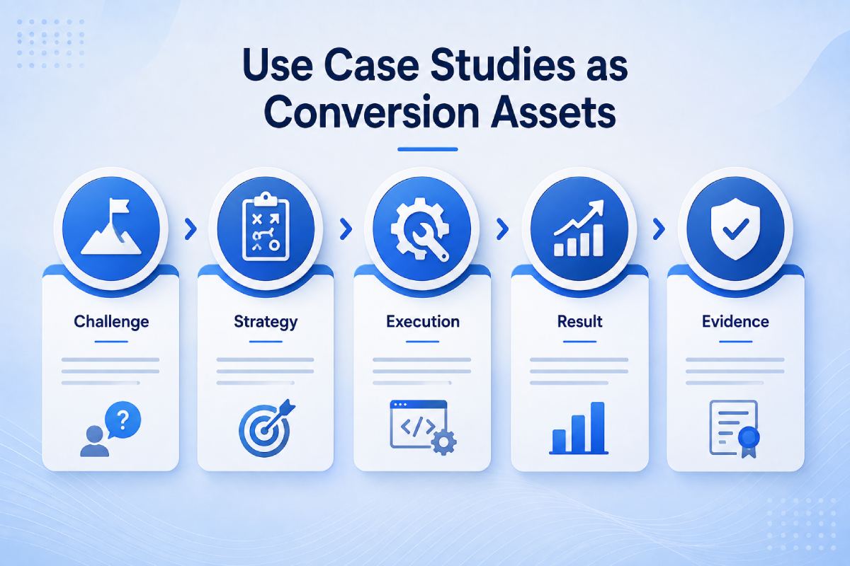
Use Case Studies as Conversion Assets
Case studies can answer a prospect’s biggest question: “Can you actually deliver this?”
A strong case study should explain:
Challenge
What was wrong?
Strategy
What approach was taken?
Execution
What was implemented?
Result
What changed?
Evidence
What can be measured?
This is particularly valuable for:
- B2B services
- software development
- marketing
- consulting
- enterprise technology
Case studies should be strategically placed near relevant CTAs rather than hidden in a portfolio section.
Design the Page Around Objection Handling
Every buyer has objections.
Depending on the business, these may include:
- How much does it cost?
- How long will it take?
- Have you done similar projects?
- Can you integrate with our systems?
- Do you work with businesses like ours?
- What happens after I enquire?
- Is there a contract?
- What happens if the project goes wrong?
A high converting website proactively answers these questions. This reduces uncertainty before the user reaches the sales conversation.
11. Use Pricing Information Strategically
Hiding all pricing can sometimes create unnecessary friction. However, not every business can publish fixed prices.
For custom services, you can explain:
- pricing factors
- starting ranges
- package structure
- what determines cost
- what’s included
- what’s excluded
For example: “Enterprise website development pricing depends on architecture, integrations, number of markets, CMS requirements, security, and custom functionality.”
This provides useful information without pretending every project has the same cost.
12. Create Dedicated Conversion Landing Pages
A conversion landing page should be designed around one specific campaign, audience, offer, or action.
For example:
- Google Ads → Google Ads Landing Page
- LinkedIn Campaign → B2B Lead Generation Page
- Email Campaign → Consultation Landing Page
Sending every campaign to the homepage introduces unnecessary distractions.
Conversion landing pages can align: Ad → Message → Offer → Proof → CTA
What Makes a High-Converting Landing Page?
Conversion landing pages typically contain:
- Clear headline
- Supporting value proposition
- Relevant visual
- Primary CTA
- Benefits
- Proof
- Objection handling
- Process
- FAQs
- Final CTA
The exact structure can vary based on the offer.
The principle remains the same: Remove distractions that don’t help the visitor make the intended decision.
13. Match Landing Pages to Traffic Sources
Different acquisition channels create different user expectations.
- Someone arriving from: Google Ads
may have high commercial intent. - Someone arriving from: SEO informational content
may still be researching. - Someone arriving from: LinkedIn
may be discovering the company for the first time. - Someone arriving from: Email
may already know the brand.
Conversion landing pages should reflect the visitor’s context through landing page optimization. This is why sending every visitor to the same generic homepage can reduce landing page optimization efficiency.
Website Navigation Should Support Conversion
Conversion website design navigation shouldn’t simply list every section of the company. It should help visitors move toward relevant information.
For a B2B service website, a useful structure might include:
- Services
- Industries
- Solutions
- Case Studies
- Resources
- About
- Contact
The exact conversion landing pages design depends on the business. But navigation should answer: “Where should I go next?” rather than: “How many pages can we put in the menu?”
Mega Menus and Enterprise Websites
Large websites may require mega menus because they contain many products or services. However, mega menus can become overwhelming.
Use:
- clear categories
- logical grouping
- short descriptions
- visual hierarchy
- prioritized links
The website CRO menu should help visitors discover relevant content without becoming a catalogue of every URL on the website.
Mobile Conversion Design Is Essential
A website isn’t conversion-focused if it works well only on desktop.
Mobile users may:
- call directly
- fill forms
- browse services
- compare products
- read reviews
- request information
Mobile conversion design should consider user experience design:
- button size
- form usability
- sticky CTAs where appropriate
- readable text
- page speed
- navigation
- content hierarchy
A form that is easy to complete on a laptop may become frustrating on a mobile device.
Page Speed Affects Conversion
Website performance isn’t only an SEO concern. Poor website performance can create friction before the visitor even sees the offer
Potential problems include:
- slow server response
- oversized images
- render-blocking resources
- excessive JavaScript
- third-party scripts
- poor caching
- inefficient API calls
A CRO web development process therefore treats performance as part of the user experience.
Design for Scanning, Not Just Reading
Most website visitors don’t read every word. They scan.
A website CRO page should therefore use:
- meaningful headings
- short paragraphs
- bullet points
- visual hierarchy
- highlighted benefits
- comparison tables
- icons where appropriate
- clear CTAs
The page should communicate its main argument even if someone only reads the headings and highlighted elements. This makes conversion focused website design more effective by keeping important information easy to understand and act on.
Use Visual Hierarchy to Guide Attention
Visual hierarchy tells users what matters most.
For example:
Primary headline
↓
Supporting value proposition
↓
Primary CTA
↓
Proof
↓
Benefits
↓
Details
↓
CTA
The visitor should not have to search for important website CRO and user experience design information. Effective conversion website design guides attention toward the information that supports the next decision. Website CRO should guide attention naturally.
Don’t Overuse Animations
Animations can make a website feel modern, but excessive motion can distract from the conversion objective.
Problems include:
- slow loading
- visual distraction
- accessibility concerns
- mobile performance issues
- delayed access to information
Use animation when it improves comprehension or interaction. Don’t use it simply because the design looks more impressive with movement.
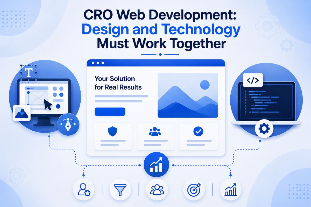
CRO Web Development: Design and Technology Must Work Together
CRO web development combines conversion strategy with frontend and backend engineering. This is important because conversion problems are not always visual.
For example: A button may look perfect, but the form could:
- fail validation
- load slowly
- lose submitted data
- produce errors
- send leads incorrectly
- lack CRM integration
Similarly, a beautiful ecommerce page can still lose sales if website performance is poor.
CRO therefore needs to involve: Strategy + UX + UI + Development + Analytics
Conversion-Focused Development Architecture
A conversion-oriented website may connect:
Traffic Sources
│
↓
Landing Pages
│
↓
Website / Application
│
├── Analytics
├── CRM
├── Marketing Automation
└── Conversion Tracking
│
↓
Lead / Sale
CRO development needs to make conversion data measurable.
Track Every Important Conversion
You can’t optimize what you don’t measure.
Depending on the business, track:
- form submissions
- phone clicks
- email clicks
- WhatsApp clicks
- demo requests
- quote requests
- purchases
- checkout completion
- downloads
- bookings
Don’t count every button click as a successful conversion. Define meaningful business outcomes.
Micro-Conversions vs Macro-Conversions
Macro Conversion
The primary business objective.
Examples:
- purchase
- qualified lead
- appointment
- demo
Micro Conversion
A smaller action indicating engagement.
Examples:
- case study view
- brochure download
- pricing page visit
- video engagement
Micro-conversions can help understand user behaviour, but they should not be confused with revenue-generating conversions.
Use Analytics to Identify Conversion Drop-Offs
A funnel might look like:
10,000 Visitors
↓
4,000 Service Page Views
↓
1,000 CTA Clicks
↓
500 Form Starts
↓
250 Form Submissions
↓
100 Qualified Leads
↓
20 Customers
- If the biggest drop happens between: CTA Click → Form Submission, you should investigate the form.
- If the drop happens earlier: Visitor → Service Page, the issue may involve traffic quality, navigation, or landing-page relevance. Data tells you where to investigate.
A/B Testing Should Be Based on a Hypothesis
CRO isn’t about changing random elements and hoping conversions improve. A proper test starts with a hypothesis. For example: “The current CTA optimization is too generic. Changing ‘Submit’ to ‘Request a Project Estimate’ may increase qualified form submissions because it communicates the outcome more clearly.”
Then test:
- Control: Submit
- Variant: Request a Project Estimate
Measure:
- conversion rate
- qualified leads
- downstream sales
The winner should be determined using meaningful data rather than assumptions.
Don’t Optimize for Cheap Conversions
A common CRO mistake is maximizing conversion volume without considering lead quality.
Suppose:
Version A
- 100 leads
- 20 qualified
Version B
- 150 leads
- 10 qualified
Version B has a higher form conversion rate. But Version A may be far more valuable to the business. For B2B companies, CRO should therefore consider: Conversion Rate + Lead Quality + Sales Qualification + Revenue, not just the number of form submissions.
Personalization Can Improve Conversion-When Used Carefully
Different visitors may respond to different messaging.
Personalization can potentially use:
- industry
- location
- traffic source
- returning visitor status
- previous interactions
- customer status
For example, an enterprise technology buyer may see content emphasizing:
- security
- scalability
- integrations
while a startup visitor may respond more strongly to:
- speed
- flexibility
- cost efficiency
However, personalization adds technical and privacy complexity. It should be introduced where the expected business benefit justifies it.
Build Trust Into Every Major Conversion Path
Trust shouldn’t exist only on an “About Us” page. It should appear close to important decisions.
For example:
Near the CTA
Client logos
Near pricing
Transparent inclusions
Near forms
Privacy reassurance
Near service claims
Case study evidence
Near technical claims
Certifications or expertise
The closer proof is to the claim it supports, the more useful it can become.
Use FAQs to Remove Final-Stage Friction
FAQs are useful when they answer genuine buyer concerns.
For a CRO web development company, questions may include:
- How much does the project cost?
- How long does development take?
- Can you integrate our CRM?
- Will the website be SEO-friendly?
- Do you provide ongoing support?
- Can the website scale?
- Who owns the source code?
For a service business, FAQs can remove uncertainty before the visitor submits an enquiry. Don’t use FAQs simply to insert keywords. Use them to resolve objections.
Conversion Design Must Be Connected to SEO
SEO and CRO shouldn’t work against each other, especially when an SEO agency is responsible for driving qualified organic traffic to the website A page can rank well but still perform poorly commercially.
The ideal relationship is:
SEO
brings the right visitor
↓
Conversion-Focused Design
helps the visitor understand and trust the offer
↓
CRO
removes friction
↓
Conversion
creates the business outcome
This is why a high-ranking page isn’t automatically a successful page.
SEO Traffic and Conversion Intent
Not all organic visitors are equally valuable.
For example:
- “what is conversion rate optimization?” is primarily informational.
- “conversion rate optimization company in Mumbai” has significantly stronger commercial intent.
A conversion rate optimization company in Mumbai should therefore have different experiences for different stages of the funnel.
Conversion-Focused Design for B2B Websites
B2B website redesign projects have additional challenges because the buying journey can be long.
A prospect may:
- visit several times
- compare vendors
- discuss options internally
- review case studies
- ask technical questions
- request pricing
- involve procurement
- involve senior management
The website therefore needs to support lead conversion, research, and lead conversion.
Useful B2B content includes:
- case studies
- service details
- implementation methodology
- technical capabilities
- industry expertise
- pricing guidance
- FAQs
- comparison content
- customer testimonials
The website becomes part of the sales process.
Conversion-Focused Design for Ecommerce
Ecommerce conversion optimization requires attention to the complete purchasing experience.
Important areas include:
- product discovery
- search
- product pages
- reviews
- pricing
- availability
- shipping information
- cart
- checkout
- payment
- returns
A beautiful homepage cannot compensate for a confusing checkout. A high converting website requires the entire purchasing journey to be optimized. Good high converting website design considers every interaction from product discovery through checkout.
Conversion-Focused Design for Service Businesses
Service businesses often have a different website design for conversions path: Search → Service Page → Proof → Consultation → Sales Conversation
The service page therefore needs to answer:
- What do you provide?
- Who is it for?
- What problem does it solve?
- How does the process work?
- Why should I trust you?
- What does it cost?
- What happens next?
This is especially important for high-value professional services where customers rarely make an immediate purchase.
Conversion Rate Optimization Company in Mumbai: What Should You Look For?
If you’re considering working with a conversion rate optimization company in Mumbai, don’t evaluate the provider only on design quality.
Ask whether the team understands:
- analytics
- user behaviour
- UX
- landing pages
- conversion funnels
- A/B testing
- website development
- CRM integration
- SEO
- performance
- lead quality
CRO is not simply changing button colours. A serious CRO engagement should combine data, design, technology, experimentation, and business outcomes.
How a Conversion Rate Optimization Company in Mumbai Engagement Process Works
A structured CRO process can follow:
1. Measurement Audit
Determine whether conversion tracking is accurate.
2. Funnel Analysis
Identify where visitors abandon the journey.
3. User Research
Understand why users may hesitate.
4. UX Review
Identify friction and usability problems.
5. Competitor Analysis
Compare positioning and conversion experiences.
6. Hypothesis Development
Define specific changes to test.
7. CRO Web Development
Build the CRO web development design and technical changes.
8. Experimentation
Test alternatives where sufficient data exists.
9. Analysis
Evaluate conversion and business-quality outcomes.
10. Iteration
Continue CRO development based on evidence.
Conversion Website Design Checklist
Before launching a website design for conversions, ask:
Strategy
- Is the primary conversion goal defined?
- Are secondary conversions defined?
- Are buyer journeys documented?
Messaging
- Is the value proposition immediately clear?
- Does the page focus on customer problems?
- Are benefits explained clearly?
UX
- Is navigation intuitive?
- Is the page easy to scan?
- Are important actions easy to find?
Trust
- Are testimonials visible?
- Are case studies available?
- Are credentials or evidence provided?
CTA
- Is there one primary action?
- Is CTA wording specific?
- Is the next step clear?
Forms
- Are unnecessary fields removed?
- Does the form work on mobile?
- Are errors clearly communicated?
Performance
- Is the website fast?
- Are images optimized?
- Is unnecessary JavaScript minimized?
Measurement
- Are conversions tracked?
- Are calls tracked where relevant?
- Are forms connected to analytics/CRM?
CRO
- Are hypotheses documented?
- Is A/B testing appropriate?
- Are qualified leads measured?
Common Conversion Design Mistakes
Designing for Awards Instead of Business
- A website can win design recognition and still fail commercially.
- Design should serve the business objective.
Too Many CTAs
- Multiple competing actions can create decision fatigue.
- Give the visitor a clear next step.
Generic Headlines
If the visitor cannot understand what you offer immediately, they may leave before exploring further.
Hidden Proof
Testimonials and case studies buried several clicks away have less impact than relevant proof placed near decision points.
Long Forms
Collect information necessary for qualification, not information simply because it might be useful later.
Slow Websites
Beautiful visual experiences are irrelevant if users abandon the website before the page loads.
No Conversion Tracking
Without reliable measurement, design decisions become assumptions.
Optimizing for Clicks Instead of Revenue
A higher click-through rate isn’t necessarily better if the resulting visitors don’t become customers.
How to Measure a High-Converting Website
There is no single metric that defines success.
Important metrics include:
Conversion Rate
Percentage of visitors completing the desired action. Conversion Rate = Conversions ÷ Visitors × 100
Lead-to-Customer Rate
How many leads ultimately become customers.
Qualified Lead Rate
Percentage of leads meeting your target criteria.
Cost Per Lead
Important when traffic comes from paid channels.
Customer Acquisition Cost
Measures the broader cost of acquiring customers.
Revenue Per Visitor
Particularly valuable for ecommerce and measurable sales funnels.
Landing Page Conversion Rate
Helps evaluate campaign-specific pages.
The most important metric should be connected to the actual business objective.
Conversion Rate Is Not the Only Goal
Imagine two websites.
Website A
- 10% conversion rate
- but produces mostly low-quality leads.
Website B
- 5% conversion rate
- but produces highly qualified enterprise opportunities.
Website B may be substantially more valuable. This is why website design for conversions should ultimately optimize for business outcomes rather than vanity metrics.
What a High-Converting Website Should Feel Like
A visitor should ideally experience a progression:
“This is relevant to me.”
↓
“They understand my problem.”
↓
“They appear capable of solving it.”
↓
“Other customers trust them.”
↓
“I understand how the process works.”
↓
“My concerns have been answered.”
↓
“I know what happens if I contact them.”
↓
“I’m comfortable taking the next step.”
That psychological progression is what conversion-focused design is trying to facilitate.
Final Conclusion
A high converting website design isn’t created by adding more buttons, larger headlines, or more animations. It is created by understanding how people make decisions and then designing the website to reduce uncertainty, communicate value, establish trust, remove friction, and guide visitors toward an appropriate next action.
The strongest conversion focused website design combines:
- Business Strategy
- Customer Research
- Messaging
- UX Design
- UI Design
- Performance
- Development
- Analytics
- CRO
The website should therefore not be treated as a digital brochure without website conversion optimization. It is part of your acquisition and sales infrastructure. When SEO, paid advertising, social media, referrals, email, and other channels bring visitors to the website, the website has a responsibility to turn that attention into measurable business opportunities.
That is the difference between a website that looks professional and a high converting website design that contributes directly to revenue.
Need a Website Designed for Conversions?
If your website receives traffic but generates fewer enquiries, purchases, bookings, or qualified leads than expected, lead conversion may be the issue rather than simply “more traffic.”
The problem could be:
- positioning
- UX
- messaging
- landing-page structure
- trust
- CTA design
- forms
- performance
- analytics
- technical implementation
A conversion-focused website assessment can identify where visitors are dropping out and which improvements should be prioritized.
Conversion-Focused Website Assessment
We can evaluate:
- Website UX
- Conversion funnel
- Landing pages
- CTAs
- Forms
- Messaging
- Trust signals
- Mobile experience
- Page performance
- Analytics and conversion tracking
- SEO/CRO alignment
- Development opportunities