
Introduction: The Real Reason Most Business Websites Fail
Every year, businesses spend thousands, or even millions, of rupees driving traffic to their websites through SEO, Google Ads, social media marketing, email campaigns, and content marketing. Yet most websites continue to convert poorly. A strong website user experience turns valuable traffic into meaningful customer actions and measurable business growth.
Business owners often assume the problem is:
- lack of traffic
- poor SEO
- insufficient advertising budget
- weak brand awareness
In reality, many websites already receive enough visitors to generate leads. The actual problem is that visitors arrive, become confused, lose trust, encounter friction, and leave without taking action.
According to multiple conversion optimization studies, the average website conversion rate across industries remains between 2% and 5%. This means that 95–98% of visitors leave without converting. For a business attracting 10,000 visitors per month, even a small increase in conversion rate can dramatically impact revenue.
Example:
- Monthly Visitors: 10,000
- Current Conversion Rate: 1%
- Leads Generated: 100
- Improved Conversion Rate: 3%
- Leads Generated: 300
Without increasing traffic, the business generates three times more leads. This is why User Experience (UX) has become one of the most important growth levers in modern digital marketing. A high-performing website does not simply look attractive; it guides visitors toward action.
In this guide, we’ll explore the most common UX mistakes that quietly destroy conversions and explain how businesses can fix them before they lose more revenue.
What Is Good User Experience?
Many people confuse User Experience with website design. A website can look beautiful while still delivering a terrible user experience. Likewise, a simple website can generate exceptional results if users can quickly find information, trust the brand, and complete their desired action.
User Experience (UX) refers to the overall experience a visitor has while interacting with a website.
This includes:
- usability
- accessibility
- speed
- navigation
- clarity
- responsiveness
- trust signals
- conversion flow
Good UX removes friction from the customer journey. Poor UX introduces obstacles. An effective website user experience combines UX design best practices with excellent website usability, helping visitors complete tasks quickly while building confidence in your business.
The Goal of UX Is Not Beauty, It’s Progress
A visitor comes to your website with a goal.
They may want to:
- Book a consultation
- Request a quote
- Compare solutions
- Buy a product
- Contact your business
Every page should help users move closer to that goal. When users struggle to find information, become confused, or encounter unnecessary complexity, they leave. This is known as friction. Every point of friction reduces conversions.
The Psychology Behind User Experience
Good UX aligns with how people naturally make decisions. Visitors typically ask themselves five questions within the first few seconds:
1. Am I in the Right Place?
Users must immediately understand what your company does. If they cannot identify your service within a few seconds, bounce rates increase dramatically.
2. Can This Company Solve My Problem?
Visitors need clear evidence that your business understands their challenge. This is where messaging, positioning, and case studies become critical.
3. Can I Trust This Company?
Trust signals include:
- testimonials
- reviews
- certifications
- client logos
- awards
- case studies
- Without trust, users hesitate.
4. What Should I Do Next?
Every page should contain a clear call-to-action.
Visitors should never wonder:
“What am I supposed to do now?”
5. Is This Worth My Time?
Users evaluate effort constantly. The more effort required, the lower the conversion rate.
This includes:
- lengthy forms
- slow pages
- complicated navigation
- unclear information
Good UX reduces effort. Understanding user behavior improves website user experience, strengthens website usability, and supports website conversion optimization by removing friction before visitors abandon their journey.
Why Does UX Impact Revenue More Than Most Businesses Realize?
Many founders view UX as a design expense. High-growth companies view UX as a revenue driver. The difference in mindset is significant.
Every UX Problem Has a Revenue Cost
When visitors encounter obstacles, businesses lose opportunities. Common examples include:
Slow Website Result:
- Higher bounce rate
- Lost leads
- Reduced SEO performance
Poor Navigation Result:
- Users cannot find key information
- Visitors leave
- Conversion rates decline
Weak Call-to-Action Result:
- Users fail to take action
- Lead generation decreases
Confusing Messaging Result:
- Trust drops
- Users abandon the website
The Revenue Leakage Framework
Think of your website as a sales funnel. Traffic enters at the top. Revenue exits at the bottom. Every UX issue creates a leak in that funnel.
Example:
10,000 Monthly Visitors
↓
5,000 Leave Due to Poor Mobile Experience
↓
2,000 Leave Due to Slow Load Times
↓
1,500 Leave Due to Confusing Navigation
↓
500 Leave Due to Weak CTAs
↓
Only a Small Percentage Converts
The website may appear functional while silently losing revenue every day.
Why Website Conversion Optimization Is Often More Valuable Than More Traffic
Many businesses focus entirely on acquiring more visitors. However, increasing conversion rates often produces better ROI.
Example:
- Current Traffic: 5,000 visitors
- Current Conversion Rate: 1%
- Leads: 50
- Instead of doubling traffic, improve UX and increase the conversion rate to 3%.
- New Leads: 150
- No additional traffic required.
This is why companies investing heavily in SEO and advertising should also invest in user experience optimization. Successful website conversion optimization starts by eliminating user experience mistakes, improving website usability, and consistently applying UX design best practices across every customer touchpoint.
The Conversion Journey: How Users Actually Behave
Before examining specific mistakes, it’s important to understand how users interact with modern websites.
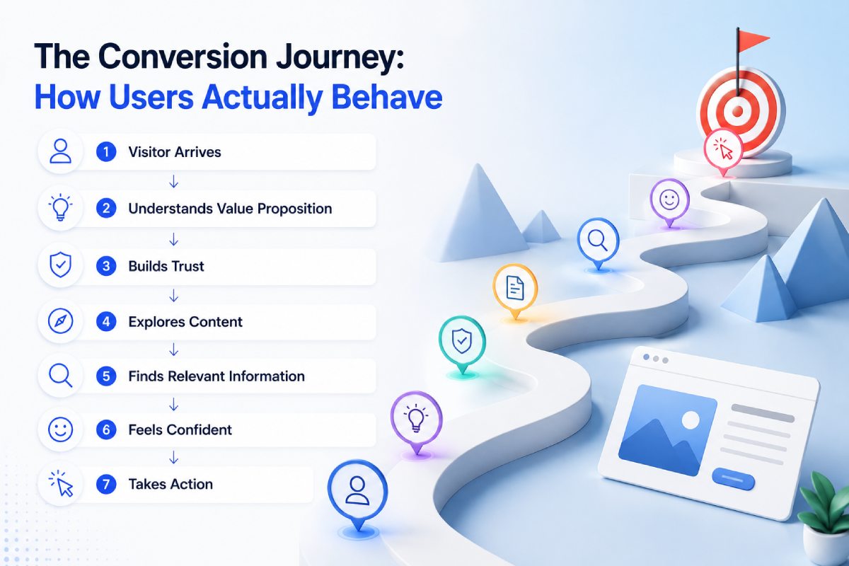
The ideal conversion journey looks like this:
Visitor Arrives
↓
Understands Value Proposition
↓
Builds Trust
↓
Explores Content
↓
Finds Relevant Information
↓
Feels Confident
↓
Takes Action
Most websites break this journey somewhere along the way. The following 15 UX mistakes are responsible for the majority of conversion failures.
UX Mistake #1: Unclear Value Proposition Above the Fold
The first section of a website often determines whether a visitor stays or leaves.
Unfortunately, many websites waste this space with generic headlines such as:
- “Transforming Businesses Through Innovation”
- “Your Partner for Growth”
- “Delivering Excellence Since 2010”
These statements sound impressive but communicate nothing specific.
Visitors should immediately understand:
- What you do
- Who you help
- Why you are different
- What action to take
Weak Example
“We Build Better Digital Experiences”
Strong Example
“SEO Services That Help Mumbai Businesses Generate More Leads and Revenue”
The second example communicates:
- service
- audience
- outcome
within seconds. This dramatically improves engagement.
UX Mistake #2: Slow Website Load Speed
Page speed has become one of the biggest conversion killers. Modern users expect websites to load almost instantly. Research consistently shows that even small delays reduce engagement and conversions.
When a page takes:
- 1 second to load → excellent
- 3 seconds → noticeable delay
- 5+ seconds → significant abandonment
Slow websites create frustration before users even consume content.
Common Causes
- oversized images
- excessive JavaScript
- poor hosting
- unoptimized code
- too many plugins
Revenue Impact
A website receiving 20,000 visitors monthly could lose hundreds of leads due to speed alone. For ecommerce businesses, slow pages often reduce both conversions and average order value.
How to Fix It
- compress images
- implement caching
- use CDN services
- optimize scripts
- improve hosting infrastructure
Speed improvements frequently produce immediate conversion gains.
UX Mistake #3: Too Many Navigation Choices
One of the most overlooked UX principles is decision fatigue. When users face too many options, they often choose none.
Many websites have navigation menus containing:
- 15+ menu items
- multiple dropdown levels
- overlapping categories
Instead of helping users, this creates confusion. A visitor seeking one answer must sift through numerous irrelevant choices.
Best Practice
Primary navigation should focus on:
- services
- solutions
- case studies
- about
- contact
Everything else should be secondary.
Example
Bad Navigation:
Home | Services | Solutions | Industries | Products | Insights | News | Careers | Resources | Tools | Downloads | Blog | Media | Events
Good Navigation:
Services | Industries | Case Studies | About | Contact
Simplification often improves engagement significantly.
UX Mistake #4: Mobile Experience Is Treated as an Afterthought
In most industries today, over 60–80% of website visitors come from mobile devices. Yet many business websites are still designed primarily for desktop users. This creates major usability problems.
Common mobile UX issues include:
- tiny text
- difficult navigation
- buttons too close together
- slow loading pages
- broken layouts
A mobile visitor who struggles to navigate your website rarely returns.
UX Mistake #5: Weak or Invisible Call-to-Action (CTA)
One of the biggest reasons websites fail to generate leads is surprisingly simple: visitors are never clearly told what to do next.
Businesses spend heavily on SEO, Google Ads, social media, and content marketing to bring visitors to their websites. Yet many websites hide their primary call-to-action below the fold, use vague button text, or fail to guide users toward the next step in the buying journey. A visitor might be interested in your services, but if the next action isn’t obvious, they often leave without converting.
Common CTA Mistakes
- Generic buttons like “Learn More”
- Too many competing CTAs
- No CTA above the fold
- Poor button visibility
- Weak copywriting
- Asking for commitment too early
Example
Weak CTA: “Submit”
Strong CTA: “Get Your Free Website Audit”
The second CTA clearly communicates value and reduces uncertainty.
Best Practice
- Every important page should contain:
- Primary CTA above the fold
- Secondary CTA in the middle
- Final CTA near the conclusion
Visitors should never need to search for the next step.
UX Mistake #6: Forms That Create Friction
Most businesses unknowingly lose leads through poorly designed forms. Many contact forms ask for excessive information before establishing trust.
Examples:
- Full Name
- Company Name
- Website
- Phone Number
- Industry
- Team Size
- Budget
- Project Timeline
- Service Required
- Additional Information
This creates unnecessary friction. The more effort required, the fewer users complete the form.
Why Long Forms Reduce Conversions
Visitors are constantly evaluating effort versus reward.
They ask themselves: “Is this worth my time?”
If the answer is uncertain, they leave.
Every additional form field increases abandonment risk.
High-Converting Forms Usually Ask For
- Name
- Phone
- One qualifying question
Nothing more. Additional information can be collected later during sales conversations.
Progressive Data Collection
Modern conversion-focused websites collect information gradually.
Stage 1: Generate the lead.
Stage 2: Qualify the lead.
Stage 3: Close the lead.
Trying to do everything at once usually reduces overall conversions.
UX Mistake #7: No Trust Signals
People rarely buy from businesses they don’t trust. This becomes even more important when visitors discover a company for the first time.
Many websites immediately ask visitors to:
- schedule calls
- request quotes
- make purchases
without first building credibility. Trust must be earned before conversion happens.
Critical Trust Signals
Client Logos
Recognizable brands increase credibility immediately.
Testimonials
Real customer experiences reduce uncertainty.
Case Studies
Proof of outcomes is more persuasive than promises.
Reviews
Third-party validation carries significant weight.
Certifications
Industry credentials reinforce expertise.
Awards
Recognition creates authority.
Example
Consider two SEO agencies.
Agency A: “We are the best SEO company.”
Agency B: “Helped 150+ businesses generate 2 million organic visitors while maintaining a 4.8-star client rating.”
Which appears more credible?
Most visitors trust evidence over claims.
UX Mistake #8: Poor Readability and Content Structure
Many websites contain excellent information that nobody reads.
Why? Because the content is difficult to consume.
Modern users scan before they read. Large walls of text create cognitive overload. Visitors feel overwhelmed and leave.
Signs of Poor Readability
- Large paragraphs
- No headings
- Tiny font sizes
- Low contrast text
- Excessive jargon
- Lack of visual hierarchy
Better Content Structure
Use:
- Short paragraphs
- Clear H2 and H3 headings
- Bullet points
- Comparison tables
- Visual frameworks
- Highlighted insights
Example
Instead of: “SEO is a process that involves multiple activities including keyword research, content development, technical optimization, and authority building.”
Use:
SEO consists of four major components:
- Keyword Research
- Technical SEO
- Content Strategy
- Authority Building
- The second format improves readability significantly.
UX Mistake #9: No Social Proof Near Conversion Points
Many websites place testimonials on separate pages.
The problem? Visitors rarely visit those pages. Trust signals should appear close to conversion opportunities.
High-Converting Placement Locations
Near:
- Contact forms
- Service CTAs
- Pricing sections
- Consultation booking areas
Example
Instead of: Book Consultation
Use: Book Consultation
⭐⭐⭐⭐⭐ Rated 4.8/5 by 700+ Clients
This small addition can significantly improve conversion rates.
UX Mistake #10: Confusing Service Pages
Many service pages focus on describing services rather than solving customer problems.
Visitors care less about: “What do you do?”
and more about: “Can you solve my problem?”
Poor Service Page Structure
About Us
↓
Company History
↓
Features
↓
Contact
Better Structure
Problem
↓
Solution
↓
Benefits
↓
Case Study
↓
Process
↓
CTA
This structure aligns with how buyers think.
UX Mistake #11: No Pricing Guidance
One of the biggest reasons visitors leave is uncertainty. While some businesses avoid discussing pricing entirely, this often creates mistrust. Visitors do not necessarily need exact pricing.
However, they usually want some indication of:
- budget range
- investment level
- project scope
Example
Instead of: “Contact us for pricing”
Use: “Most projects range between ₹50,000 and ₹2,00,000 depending on scope.”
This helps qualify leads and reduces friction.
UX Mistake #12: Ignoring User Intent
Many websites present the same message to every visitor. This is a mistake. Different users have different objectives. A founder, marketing manager, and procurement head may all visit the same website with completely different goals.
Intent-Based UX
Create pathways for:
- Awareness Visitors
Educational content
- Evaluation Visitors
Case studies
- Decision Visitors
Pricing and consultation CTAs
The better the alignment between intent and content, the higher the conversion rate.
UX Mistake #13: Poor Mobile UX Design
Mobile UX deserves its own section because it is responsible for an enormous percentage of lost conversions.
Mobile UX Problems
Tiny Buttons
Users struggle to interact.
Difficult Forms
Typing becomes frustrating.
Large Pop-Ups
Content becomes inaccessible.
Slow Loading Pages
Bounce rates increase dramatically.
Poor Layouts
Users become confused.
Mobile UX Best Practices
- Thumb-friendly buttons
- Click-to-call CTAs
- Fast page speed
- Short forms
- Simple navigation
A website that performs well on desktop but poorly on mobile is leaving money on the table.
UX Mistake #14: No Conversion Tracking
Many businesses don’t know where leads are being lost. Without analytics, UX optimization becomes guesswork.
Track:
- Scroll depth
- Heatmaps
- Click behavior
- Form abandonment
- Landing page performance
Tools such as:
- Google Analytics
- Microsoft Clarity
- Hotjar
can reveal UX issues that are otherwise invisible.
UX Mistake #15: Designing for Internal Teams Instead of Users
Perhaps the most common UX mistake is designing based on internal opinions.
Many websites are built around:
- CEO preferences
- management assumptions
- internal politics
- instead of user behavior.
User-Centered Design Principle
The website should answer:
“What does the visitor need?”
not
“What do we want to tell them?”
Companies that adopt this mindset typically outperform competitors.
Mobile UX Issues That Hurt Conversions
Mobile traffic now dominates most industries. Yet mobile conversion rates often remain significantly lower than desktop rates. The reason is simple: Many businesses have responsive websites but not mobile-optimized experiences.
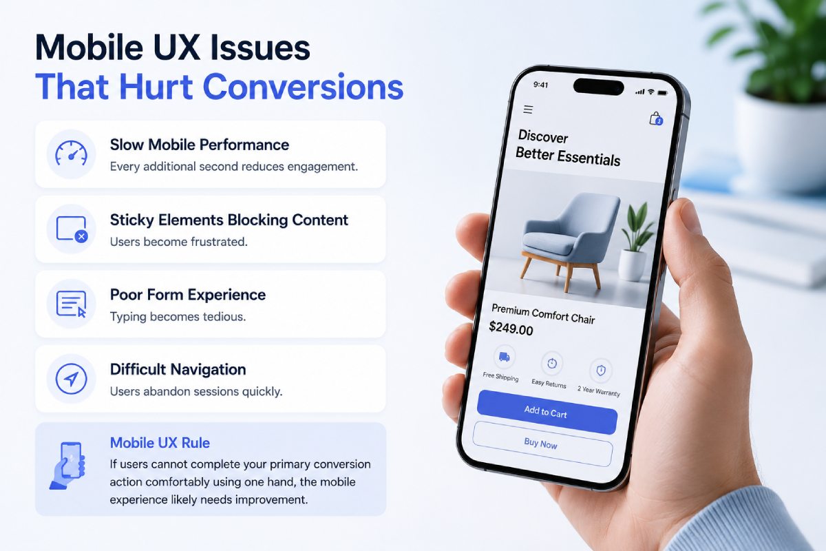
Mobile Conversion Killers
Slow Mobile Performance
Every additional second reduces engagement.
Sticky Elements Blocking Content
Users become frustrated.
Poor Form Experience
Typing becomes tedious.
Difficult Navigation
Users abandon sessions quickly.
Mobile UX Rule
If users cannot complete your primary conversion action comfortably using one hand, the mobile experience likely needs improvement.
Navigation Problems That Cost Revenue
Navigation exists to help visitors find information quickly. Poor navigation creates confusion, frustration, and abandonment.
Common Navigation Problems
- Too many menu items
- Unclear labels
- Complex dropdowns
- Hidden contact information
- Inconsistent navigation structure
Conversion-Focused Navigation Framework
- Home
- Services
- Industries
- Case Studies
- About
- Contact
Simple navigation generally converts better than complex navigation.
Poor CTA Placement: The Silent Conversion Killer
Even strong CTAs fail when positioned incorrectly. Visitors should encounter calls-to-action naturally throughout the customer journey.
Ideal CTA Placement
Above the Fold
Capture high-intent visitors immediately.
Mid-Page
For users evaluating solutions.
Bottom of Page
For users ready to take action. Repeated CTAs often outperform single CTA implementations.
Avoiding common user experience mistakes, following UX design best practices, and improving website usability helps businesses create smoother customer journeys that convert more visitors into qualified leads.
UX Audit Checklist for Business Websites
Use this quick audit framework:
Messaging
- Clear value proposition
- Audience-specific messaging
- Strong differentiation
Navigation
- Simple menu structure
- Easy access to key pages
- Mobile-friendly navigation
Performance
- Fast loading pages
- Mobile optimization
- Core Web Vitals compliance
Trust
- Testimonials
- Reviews
- Client logos
- Case studies
Conversion
- Strong CTAs
- Short forms
- Conversion tracking
- Multiple lead capture opportunities
Framework Diagram
Traffic
↓
Landing Page
↓
Trust Building
↓
User Experience
↓
Conversion
↓
Revenue
Key Takeaway
Most business websites do not fail because they lack traffic. They fail because they create friction. Small UX improvements can often generate larger revenue gains than increasing advertising budgets or driving more traffic.
The businesses that win in 2026 will not necessarily be those with the most visitors but rather those with the best user experiences.
Website Conversion Rate Benchmarks (2026)
One of the most common questions business owners ask is: “What conversion rate should my website achieve?”
The answer depends on industry, traffic quality, offer strength, and user experience. Many businesses assume their website performs adequately because leads occasionally arrive. However, when benchmarked against industry standards, they often discover significant improvement opportunities.
A website converting at 1% may appear successful until competitors convert at 4–6%. The difference can represent hundreds or thousands of additional leads annually.
Average Website Conversion Benchmarks
| Website Type | Average Conversion Rate |
| B2B Services | 2% – 5% |
| SaaS Websites | 3% – 8% |
| Ecommerce Stores | 1% – 4% |
| Healthcare Websites | 3% – 10% |
| Local Service Businesses | 5% – 15% |
| Landing Pages | 10% – 25% |
What Separates High-Converting Websites?
The highest-performing websites generally excel in five areas:
Clear Messaging
Visitors immediately understand:
- What the company does
- Who it serves
- Why it matters
Strong Trust Signals
Visitors feel safe engaging with the business.
Excellent User Experience
Navigation feels effortless.
Conversion-Focused Design
Every page guides users toward action.
Fast Performance
No friction caused by slow loading times.
The Real Benchmark That Matters
Instead of comparing yourself only against industry averages, compare:
Current Conversion Rate
↓
Potential Conversion Rate
Example:
- Current: 1.5%
- Potential: 4%
- Monthly Traffic: 10,000
- Current Leads:150
- Potential Leads: 400
- Additional Leads: 250 Monthly
This illustrates why UX improvements often generate more ROI than acquiring additional traffic.
UX vs UI: Understanding the Difference
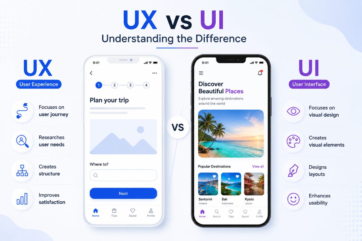
Many businesses use UX and UI interchangeably. They are related but fundamentally different.
What Is UI (User Interface)?
UI refers to visual elements.
This includes:
- colors
- typography
- buttons
- layouts
- graphics
- design aesthetics
UI determines how a website looks.
What Is UX (User Experience)?
UX refers to how users interact with the website.
It includes:
- usability
- navigation
- information flow
- accessibility
- efficiency
- conversion paths
UX determines how a website works.
Example
A luxury hotel may have:
- Beautiful photography
- Elegant animations
- Premium design
- Excellent UI
However, if users cannot:
- Find room pricing
- check availability
- make bookings
Then the UX is poor.
Simple Analogy
UI = Interior Design
UX = Building Architecture
A beautiful building with confusing floor plans creates frustration. Similarly, a beautiful website with poor usability fails to convert.
Real UX ROI Examples
Many companies underestimate the financial impact of UX optimization because improvements often appear small. However, even minor UX changes can create substantial revenue gains.
Example 1: CTA Optimization
- Before: Conversion Rate = 1.8%
- After: Conversion Rate = 3.2%
- Traffic: 15,000 visitors/month
- Leads Before: 270
- Leads After: 480
- Increase: +210 Leads Monthly
Without increasing traffic.
Example 2: Form Simplification
Before: 10 Form Fields
After: 4 Form Fields
Results:
- 37% increase in form completions
- Lower abandonment rates
- Higher lead volume
The business generated more opportunities simply by reducing friction.
Example 3: Mobile Optimization
Before: Mobile Conversion Rate = 0.8%
After: Mobile Conversion Rate = 2.5%
Revenue Impact: More than 3X increase in mobile-generated leads.
Key Insight
Most UX improvements do not produce: 10% gains
They often produce:
- 50%
- 100%
- 200%
conversion improvements because they address major friction points. Applying UX design best practices strengthens website user experience, ensuring attractive designs also deliver seamless navigation, higher engagement, and stronger conversion performance.
How to Conduct a Professional UX Audit?
Many businesses know their website underperforms but struggle to identify the exact causes. A structured UX audit helps uncover hidden conversion barriers.
Step 1: Evaluate First Impressions
Ask:
Can visitors understand:
- what we do?
- who we help?
- why choose us?
- within 5 seconds?
If not, messaging needs improvement.
Step 2: Review Navigation
Questions:
- Can users find important information quickly?
- Are menus simple?
- Do pages follow logical structures?
Confusing navigation frequently causes abandonment.
Step 3: Analyze Mobile Experience
Test:
- page speed
- forms
- navigation
- CTAs
Most businesses discover mobile problems they never noticed before.
Step 4: Examine Trust Signals
Review:
- testimonials
- reviews
- certifications
- case studies
- client logos
Trust gaps often explain poor conversion rates.
Step 5: Evaluate Conversion Paths
Identify:
- primary CTA
- secondary CTA
- lead generation flow
Every page should guide users toward a next step.
Step 6: Review Analytics
Use:
- Google Analytics
- Microsoft Clarity
- Hotjar
to identify:
- drop-off points
- rage clicks
- form abandonment
- scroll depth issues
Analytics reveal what users actually do rather than what businesses assume they do.
How AI Is Changing Website User Experience in 2026?
Artificial Intelligence is reshaping user expectations. Visitors increasingly expect personalized experiences. Static websites are gradually becoming less effective.
AI-Powered Personalization
Modern websites can adjust content based on:
- location
- behavior
- device
- referral source
This creates more relevant experiences.
AI Chat Assistants
AI-powered assistants can:
- answer questions
- qualify leads
- schedule meetings
- provide recommendations
without human intervention. This reduces friction and improves engagement.
Predictive User Journeys
AI can identify:
- likely drop-off points
- high-conversion users
- purchase intent
allowing businesses to optimize experiences proactively.
Dynamic Content Experiences
Future websites will increasingly adapt content in real time.
Different users may see:
- different CTAs
- different case studies
- different messaging
based on intent.
The Future of UX
The next generation of websites will focus less on static design and more on intelligent experiences that adapt to individual users.
How Ideamagix Builds Conversion-Focused Websites?
At Ideamagix, website design is not viewed as a creative exercise. It is viewed as a business growth system.
Every design decision is evaluated based on its impact on:
- user experience
- engagement
- lead generation
- revenue
Our Framework
Research
↓
User Journey Mapping
↓
UX Architecture
↓
UI Design
↓
Development
↓
Conversion Optimization
↓
Continuous Improvement
What We Focus On
Conversion-Centered Design
Designs that guide users toward action.
Mobile-First Experiences
Optimized for modern browsing behavior.
Performance Optimization
Fast websites improve both UX and SEO.
Trust Building
Testimonials, reviews, case studies, and authority signals integrated strategically.
Data-Driven Improvements
Continuous optimization based on real user behavior.
Our Goal
Traffic
↓
Engagement
↓
Trust
↓
Leads
↓
Revenue
Because a website should be more than a digital brochure, it should function as a business growth engine.
Conclusion: Great UX Is Revenue Optimization
Many businesses believe they have traffic problems. In reality, they often have conversion problems. The difference is important.
A website generating: 10,000 visitors
- and converting at: 1%
- generates: 100 leads.
- Improve UX and conversion rates to: 3%
- and the same traffic generates: 300 leads.
- No additional SEO.
- No additional advertising.
- No additional traffic acquisition.
Just a better experience. In 2026, businesses that win online will not necessarily be those with the biggest budgets. They will be those who create the most frictionless path from visitor to customer.
FAQs About Website User Experience and Conversion Optimization
1. What is user experience (UX) in website design?
User Experience (UX) refers to the overall experience a visitor has while interacting with a website. It includes how easily users can navigate pages, find information, complete actions, and achieve their goals. Good UX removes friction from the customer journey, while poor UX creates confusion and frustration that often leads visitors to leave the website.
A common misconception is that UX is only about visual design. In reality, UX encompasses website structure, navigation, page speed, readability, accessibility, trust signals, mobile usability, and conversion paths. Even a visually attractive website can fail if users cannot quickly understand what the business offers or how to take the next step.
From a business perspective, UX directly impacts key metrics such as bounce rate, session duration, lead generation, conversion rate, and customer acquisition costs. Companies that prioritize user experience typically generate more leads from the same amount of traffic because visitors encounter fewer obstacles during their journey.
Key Insight: UX is not a design feature—it is a business growth driver that influences every stage of the customer journey.
2. Why does user experience affect website conversions?
User experience influences conversions because every buying decision involves trust, clarity, and ease of action. When visitors land on a website, they subconsciously evaluate whether the business appears credible, relevant, and easy to engage with. Poor UX introduces uncertainty and friction that interrupt this evaluation process.
For example, if a website loads slowly, users may leave before viewing any content. If navigation is confusing, visitors may fail to find key information. If forms are too complicated, users may abandon them before submitting an inquiry. Each of these problems reduces conversion rates.
Good UX creates a seamless journey where visitors understand the value proposition, find relevant information, trust the business, and feel confident taking action. The result is higher lead generation without necessarily increasing traffic.
Key Insight: Better UX does not just improve user satisfaction; it directly increases revenue by reducing conversion barriers.
3. What are the most common user experience mistakes businesses make?
Many businesses unknowingly make UX mistakes that reduce conversions despite investing heavily in marketing. Some of the most common issues include unclear messaging, slow page speed, poor mobile usability, weak calls-to-action, lengthy forms, and complicated navigation structures.
Another frequent mistake is focusing too much on aesthetics while neglecting usability. Businesses often prioritize animations, visual effects, or creative layouts without considering whether users can quickly find information and complete actions. This creates websites that look impressive but perform poorly.
Lack of trust signals is another major issue. Visitors need evidence that a company is credible before contacting or purchasing from it. Without reviews, testimonials, case studies, or client logos, trust remains low.
Key Insight: Most conversion problems are caused by usability issues rather than traffic shortages.
4. How can I improve my website conversion rate?
Improving conversion rates starts with understanding how visitors interact with your website. The first step is identifying friction points that prevent users from progressing through the customer journey. Analytics tools such as Google Analytics, Microsoft Clarity, and Hotjar can reveal where visitors drop off or abandon actions.
Businesses should focus on improving messaging, page speed, navigation, trust signals, and call-to-action placement. Simplifying forms and making mobile experiences more intuitive often produce significant gains. In many cases, small improvements in these areas lead to noticeable increases in leads and revenue.
Conversion optimization should be treated as an ongoing process rather than a one-time project. Continuous testing and refinement help businesses adapt to changing user behavior and improve performance over time.
Key Insight: The highest-performing websites are constantly optimized based on real user behavior rather than assumptions.
5. How important is mobile user experience in 2026?
Mobile UX is more important than ever because the majority of website traffic now comes from smartphones. Depending on the industry, mobile users may account for 60–90% of total visitors. Despite this, many websites continue to provide a better desktop experience than a mobile experience.
Common mobile UX issues include slow loading times, difficult navigation, small buttons, intrusive pop-ups, and lengthy forms. These problems often cause visitors to leave before converting. Since mobile users are frequently browsing while multitasking, they have less patience for friction.
Businesses should design mobile experiences around speed, simplicity, and ease of interaction. Mobile-first design is no longer optional; it is a necessity for maintaining competitiveness and maximizing conversions.
Key Insight: A poor mobile experience can eliminate the benefits of otherwise successful SEO and advertising campaigns.
6. What role does page speed play in user experience?
Page speed is one of the most important UX factors because it influences both user satisfaction and conversion rates. Modern users expect websites to load almost instantly. Even a delay of a few seconds can significantly increase bounce rates and reduce engagement.
Slow websites create negative first impressions before visitors even consume content. They also make navigation feel frustrating and reduce trust in the business. In addition, page speed affects search engine rankings because Google considers performance an important ranking factor.
Improving page speed often involves optimizing images, reducing unnecessary code, implementing caching, using content delivery networks (CDNs), and improving hosting infrastructure. Faster websites generally produce better engagement and higher conversion rates.
Key Insight: Speed affects every stage of the user journey, from first impressions to final conversions.
7. How many form fields should a lead generation form have?
The ideal number of form fields depends on the business objective, but in most cases, shorter forms convert better. Every additional field introduces friction and increases the likelihood that users will abandon the process.
For most service-based businesses, collecting only essential information is sufficient. Common fields include:
- Name
- Phone Number
- Service Requirement
Additional qualification questions can be asked later during consultations or sales calls. Businesses often make the mistake of trying to gather too much information upfront, which reduces lead volume unnecessarily. The goal of the form should be to start the conversation, not complete the entire sales process.
Key Insight: The easiest form to complete is usually the highest-converting form.
8. What is the difference between UX and conversion rate optimization (CRO)?
User Experience (UX) focuses on improving how users interact with a website, while Conversion Rate Optimization (CRO) focuses on increasing the percentage of visitors who complete desired actions. Although they are different disciplines, they are closely connected.
UX aims to create intuitive, friction-free experiences. CRO uses testing, analytics, and behavioral data to identify opportunities for improving conversions. Many CRO improvements involve UX changes such as better navigation, clearer messaging, or improved CTA placement.
A website with poor UX will struggle to achieve strong conversion rates, regardless of how much traffic it receives. This is why successful conversion optimization initiatives often begin with UX audits.
Key Insight: UX creates the foundation, while CRO maximizes performance.
9. How often should a website UX audit be conducted?
A professional UX audit should typically be conducted at least once every six to twelve months. However, websites undergoing significant traffic growth, redesigns, or marketing campaigns may benefit from more frequent evaluations.
User behavior changes over time as technology evolves and customer expectations shift. What worked two years ago may no longer provide the best experience today. Regular audits help identify new friction points before they negatively impact performance.
A UX audit should evaluate mobile usability, navigation, page speed, content structure, conversion paths, trust signals, and analytics data. Continuous improvement is one of the defining characteristics of high-performing websites.
Key Insight: UX optimization is not a one-time activity; it is an ongoing process of improvement.
10. What is a good website conversion rate?
There is no universal conversion rate benchmark because performance varies by industry, traffic source, and business model. However, many business websites achieve conversion rates between 2% and 5%, while high-performing websites often exceed 8, 10%.
The more important question is not whether a conversion rate is good in isolation, but whether it can be improved. A website converting at 2% may still have opportunities to reach 4% or higher through UX improvements and conversion optimization.
Businesses should focus on maximizing conversions from existing traffic before investing heavily in acquiring additional visitors. Often, improving conversion rates generates faster ROI than increasing traffic volumes.
Key Insight: The best conversion rate is not the industry average; it is the highest rate your website can realistically achieve.