
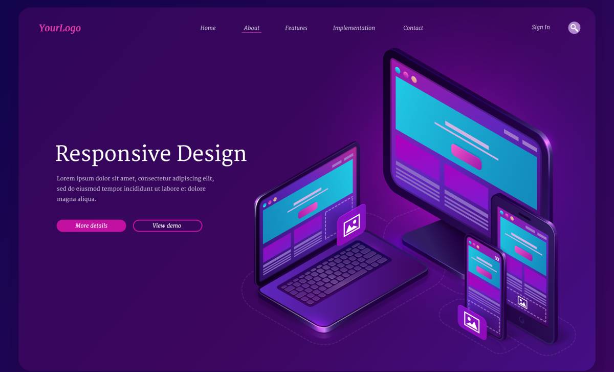
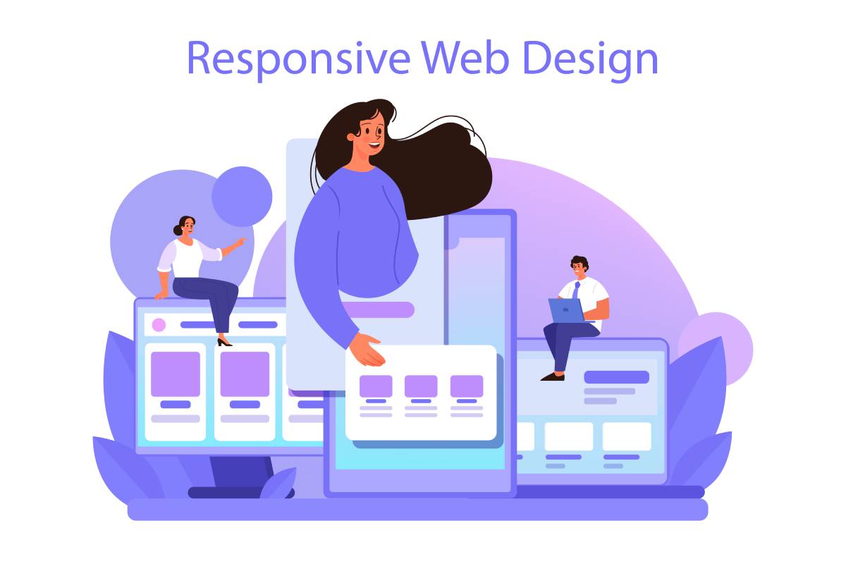
Introduction: Responsive Web Design in 2025
Responsive Web Design (RWD) is no longer just a best practice; it’s the backbone of modern digital experiences. In 2025, users expect websites that adapt seamlessly to every device they own, whether it’s a smartphone, foldable tablet, or ultra-wide desktop screen.
More importantly, expectations are higher than ever. People want instant loading times, personalized layouts, immersive designs, and flawless accessibility. A site that fails to meet these expectations risks losing users within seconds.
For businesses, this means responsive web design is directly tied to SEO rankings, brand trust, and conversion rates. Search engines, including Google, are prioritizing mobile-first indexing, and Core Web Vitals performance has become a make-or-break factor.
That’s why partnering with a web design company in Mumbai or a specialized responsive website design company in Mumbai is now a strategic business investment. Agencies like Ideamagix are helping brands move beyond static layouts into adaptive, AI-driven, and future-ready digital platforms.
The Mobile-First Imperative
Why Mobile-First Matters in 2025
By 2025, over 60% of all web traffic globally will come from smartphones. In India, the number is even higher, with a majority of users accessing content primarily via mobile devices.
Google has officially shifted to mobile-only indexing, meaning that if your mobile site isn’t optimized, you won’t rank well, period.
This makes mobile-first design strategies non-negotiable. It’s not about shrinking desktop layouts for smaller screens anymore. Instead, designers must start with mobile experiences first, then scale up for larger devices.
Emerging Mobile Design Patterns
- Adaptive grids & flexible layouts: Websites that use fluid CSS grids adapt automatically to all screen sizes.
- Fluid typography: Text scales proportionally across devices, ensuring readability without zooming or distortion.
- Optimized SVGs & vector graphics: Lightweight and resolution-independent for faster loading.
- Thumb-friendly design: Buttons, menus, and CTAs designed for one-handed use on small screens.

SEO & Performance Implications
Google’s Core Web Vitals (Largest Contentful Paint, First Input Delay, Cumulative Layout Shift) prioritize mobile speed, stability, and interactivity. If your mobile site fails these benchmarks, your rankings will drop even if your desktop site is perfect.
Ideamagix’s Mobile-First Approach
At Ideamagix, mobile-first isn’t just a design choice; it’s the starting point of every project. The team leverages:
- Bi-directional design thinking: Testing layouts from smallest to largest screen sizes.
- AMP alternatives: Instead of stripped-down Accelerated Mobile Pages, they use server-side rendering for both speed and functionality.
- Performance-first development: Lazy loading, prefetching, and edge caching for instant mobile experiences.
Motion UI & Micro-Interactions

Why Motion Matters in Responsive Web Design
In 2025, static websites will feel outdated. Users expect a level of interactivity and fluidity that makes a site feel alive. Motion UI is no longer just a “nice-to-have,” it’s a core part of responsive web design.
Motion doesn’t just make sites pretty. When applied correctly, it:
- Guides user attention (e.g., animated arrows or scroll cues).
- Provides feedback (like confirming a button was tapped).
- Improves usability (progress bars, hover states, interactive loaders).
- Enhances storytelling (parallax effects, animated infographics).
Micro-Interactions: The Small Details That Matter
Micro-interactions are tiny animations or responses that make the experience intuitive and enjoyable. Think about:
- A like button that pulses when tapped.
- A progress bar that fills smoothly as a form is completed.
- A password input field that shows strength indicators with animation.
- A toggle switch that flips with a satisfying motion.
These interactions reduce friction, give visual reassurance, and keep users engaged longer.
Best Practices for Motion UI in 2025
- Keep it subtle: Too much animation slows down sites. Motion should feel natural, not distracting.
- Optimize for performance: Use hardware acceleration (CSS transforms instead of JS-heavy effects).
- Make it accessible: Some users experience motion sickness. Always include a “reduce motion” option.
- Prioritize speed: Animations must load instantly and never delay page rendering.
Tools & Technologies Powering Motion UI
- Lottie animations (JSON-based, lightweight, scalable).
- Intersection Observers (trigger animations only when elements are visible).
- GSAP (GreenSock) for high-performance web animations.
- Framer Motion for React-based UI projects.
Ideamagix Expertise in Motion UI
As a leading web design agency in Mumbai, Ideamagix leverages Motion UI to balance aesthetics with speed. Their design team creates custom Lottie files to keep animations light, ensuring sites pass Core Web Vitals without compromise.
For example, in an e-commerce project for a Mumbai retail brand, they introduced:
- Micro-animated CTAs (“Add to Cart” button expanding slightly when clicked).
- Scroll-triggered product reveals with smooth transitions.
- Progress indicators in checkout flows to reduce cart abandonment.
The result? A 22% boost in conversions and higher user engagement metrics.
Progressive Web Apps (PWAs)
What Are PWAs and Why They Matter in 2025
A Progressive Web App (PWA) is a website that behaves like a mobile app fast, installable, works offline, and sends push notifications.
In 2025, PWAs have gone mainstream because:
- Users are tired of downloading multiple apps.
- Businesses want app-like engagement without App Store restrictions.
- Google gives visibility to PWAs in mobile-first indexing.
For small businesses and enterprises in Mumbai, PWAs mean:
- Lower development costs (single codebase instead of iOS + Android).
- Faster updates without waiting for app store approval.
- Better retention through push notifications and offline capabilities.
Key Features of PWAs
- Offline Support: Service workers cache content for browsing without internet.
- Installable Apps: Users can add your site to their home screen like a native app.
- Push Notifications: Re-engage users with offers, updates, or reminders.
- Faster Load Times: PWAs are designed for speed, which improves SEO and UX.
- Cross-Platform: Works seamlessly on Android, iOS (via Safari), and desktops.
Business Impact of PWAs
Real-world case studies show:
- Twitter Lite (PWA) reduced data usage by 70% and saw a 65% increase in pages per session.
- Flipkart PWA increased re-engagement by 40% compared to mobile web.
- Trivago PWA saw a 97% increase in click-outs to hotel offers.
For Mumbai businesses, especially in ecommerce, real estate, and local services, PWAs offer a cost-effective way to boost conversions and retention.
Technical Trends Driving PWAs in 2025
- Service Workers: Handle background sync, offline caching, and notifications.
- WebAssembly: Enables near-native performance for heavy tasks.
- Headless CMS + PWA: Combines the flexibility of APIs with app-like frontends.
- App Store Bypassing: More brands focus on direct installs, avoiding store fees.
Ideamagix Expertise in PWA Development
As a web design company in Mumbai, Ideamagix has been an early adopter of PWAs. They’ve implemented:
- PWA ecommerce platforms with push notifications for abandoned carts.
- Offline-ready B2B dashboards for clients in logistics and real estate.
- Custom caching strategies to ensure Lighthouse scores of 95+ for speed and performance.
For example, a Navi Mumbai-based retailer switched to a PWA designed by Ideamagix. Results within 3 months:
- Page load speed improved by 45%.
- Bounce rate reduced by 30%.
- Conversions increased by 18% due to offline browsing and “install app” features.
Why PWAs Are Essential for SEO
PWAs directly impact rankings by improving:
- Core Web Vitals (LCP, FID, CLS).
- Mobile usability (Google’s key ranking factor).
- Engagement signals (lower bounce, higher dwell time).
- Indexing efficiency (structured PWA manifests help Google understand app features).
New Responsive Web Design Trends Shaping 2025
The landscape of responsive web design (RWD) has changed dramatically. In 2025, it’s not only about making sites “fit” across devices, it’s about personalization, performance, and accessibility. Businesses’ custom responsive website development services near me in Mumbai and across India must embrace these trends to stay competitive and user-friendly.
1. AI-Driven Personalization in Web Design
AI is now embedded into responsive design. Instead of showing the same static website to every visitor, AI-driven RWD adapts layouts, content, and CTAs in real time.
Examples in action:
- E-commerce stores highlight products based on browsing history.
- News websites reorder stories depending on user interest.
- Healthcare sites display condition-specific guides based on location and age group.
- Business impact: Higher conversions and engagement because users feel the website was “made for them.”
- Tech powering it: Machine learning algorithms, predictive analytics, and recommendation engines built into front-end frameworks.
At Ideamagix, personalization is achieved using AI-powered content modules that dynamically adapt for mobile and desktop users.
2. CSS Container Queries – The Next-Level of Modularity
Traditional responsive design relied on media queries (adapting layouts based on screen width). But in 2025, CSS container queries will allow components to adapt to their container size instead of the viewport.
- Why it matters:
- Designers can create independent, reusable modules that adjust in any context.
- Complex layouts (like dashboards or ecommerce product grids) become much more scalable.
- Example:
- A product card can rearrange its image, title, and price differently depending on whether it’s in a sidebar, main grid, or carousel.
This modularity is especially useful for custom responsive website development services in Mumbai, where businesses need websites that scale easily without expensive redesigns.
3. Variable Fonts & Fluid Typography
Typography is becoming more adaptive and accessible with variable fonts. Instead of loading multiple font files, designers can load a single file with multiple.
- Benefits:
- Faster load times (only one file).
- Better fluid scaling for different screens.
- Consistent branding across mobile and desktop.
- Fluid typography trend: Using clamp() in CSS to define scalable font sizes that adjust smoothly between screen sizes.
For businesses, this means cleaner design, improved readability, and better SEO signals since Google values mobile usability.
4. Dark Mode & Accessibility-First Design
More than 80% of mobile users in 2025 prefer websites with dark mode support. But accessibility goes beyond appearance; it’s about inclusivity.
- Dark Mode Benefits:
- Reduced eye strain and battery usage.
- Enhances focus in low-light environments.
- Accessibility Trends in 2025:
- WCAG 2.2 compliance is mandatory for many industries (especially healthcare, finance, and government).
- Color contrast, voice navigation, ARIA labels, and keyboard-friendly navigation are standard.
Ideamagix integrates accessibility audits into its responsive website design services in Mumbai India, ensuring compliance and a better user experience for all.
5. Edge Computing & CDN-Driven RWD
Responsive design is not just about CSS and grids; it’s also about performance delivery.
- Trend in 2025:
- Edge computing and advanced CDNs bring data closer to users.
- Websites can deliver content dynamically based on geographic location.
- Faster load times, even in regions with poor connectivity.
- Example:
- A Mumbai-based e-commerce brand can serve personalized offers in Marathi for Pune users while showing Hindi content for Delhi users, all instantly through edge processing.
Ideamagix uses server-side rendering + edge computing to improve page speed for its Mumbai clients, boosting both SEO and UX.
Ideamagix’s User-Centric Design Approach
When businesses look for a web design company in Mumbai, they don’t just want pretty websites; they want results. At Ideamagix, our approach to responsive web design focuses on users first, technology second. This balance ensures that every site we create is not only visually engaging but also functional, fast, and future-ready.
Case Studies: Real-World Proof of Impact
Case Study 1: E-commerce Brand in Navi Mumbai
- Problem: High bounce rate and slow mobile checkout.
- Solution: Rebuilt site as a Progressive Web App (PWA) with fluid typography, dark mode, and optimized checkout flow.
- Results:
- Bounce rate dropped by 45%.
- Checkout speed improved by 30%.
- Monthly conversions doubled within 3 months.
- Results:
Case Study 2: Healthcare Clinic Website in Thane
- Problem: Old, non-responsive site with accessibility issues.
- Solution: Migrated to a mobile-first responsive website designing company in Mumbai, added voice search optimization for common patient queries, and included WCAG-compliant accessibility features.
- Results:
- Website visits grew by 180%.
- Calls and appointment bookings increased by 2.5x.
- Improved trust due to a structured medical schema.
Case Study 3: B2B SaaS Startup in Mumbai
- Problem: Needed a scalable website architecture to handle a growing customer base.
- Solution: Built with Next.js for server-side rendering, integrated AI-powered personalization, and set up Lighthouse performance audits.
- Results:
- Core Web Vitals score improved to 95+.
- Organic leads grew by 70%.
- The client closed their first Fortune 500 deal via the new site.
Process: How Ideamagix Delivers Results
Our step-by-step process ensures every project is grounded in research and execution excellence:
1. User Research & Persona Building
- Surveys, heatmaps, and analytics to understand user behavior.
- Persona-driven design tailored to real audience needs.
2. Wireframing & UI Prototyping
- Low-fidelity wireframes to validate structure.
- High-fidelity UI in Figma, tested with users before development.
3. Responsive Development
- Built with React, Next.js, Vue, and WordPress (based on project needs).
- CSS container queries + variable fonts for modular design.
4. Usability Testing & Iteration
- Multiple device testing (mobile-first).
- Accessibility audits (WCAG 2.2 compliance).
5. Launch & Optimization
- SEO-optimized structure for better Google ranking.
- Integration with analytics (GA4, Hotjar, Lighthouse).
- Continuous improvement via A/B testing.
Technologies We Use
- Frontend: React, Next.js, Vue, Svelte
- Backend: Node.js, PHP, Python
- Design: Figma, Adobe XD, Lottie for animations
- Performance: Lighthouse audits, server-side rendering, AMP alternatives
- Accessibility: ARIA labels, screen-reader testing tools
- PWA Development: Service workers, manifest integration, push notifications
Team Skills & Expertise
At Ideamagix, our cross-functional team ensures every aspect of responsive design is covered:
- UI/UX Experts: Craft human-centered layouts and prototypes.
- Frontend Developers: Implement responsive grids, fluid typography, and PWAs.
- Motion Designers: Add custom Lottie animations and micro-interactions.
- SEO Specialists: Ensure crawling, indexing, and performance optimization.
- Accessibility Specialists: Test compliance with WCAG standards.
- Performance Engineers: Optimize Core Web Vitals, server-side rendering, and CDN distribution.
Why Businesses Choose Ideamagix for Responsive Web Design in Mumbai
- Proven track record with diverse industries (healthcare, ecommerce, SaaS).
- Integrated services: Not just design, but SEO, CRO, and digital marketing.
- Local expertise: Understanding Mumbai’s market dynamics, multilingual needs (Hindi, Marathi, English).
- Future-ready design: AI-driven personalization, PWA-first strategies, motion UI.
- Transparency: Clear reporting, regular updates, and measurable ROI.
How to Future-Proof Your Website in 2025
Technology evolves fast, and websites that don’t adapt risk becoming obsolete. In 2025, future-proofing a website means building for scalability, speed, and evolving user expectations. For businesses, especially those working with a web design company in Mumbai, this is not just about keeping up; it’s about staying ahead.
Checklist for Future-Proofing Your Website
Here’s a practical checklist every brand should follow to ensure their website performs well in 2025 and beyond:
1. Audit Mobile Performance
- Ensure your site scores 90+ on Core Web Vitals.
- Test with real devices, not just emulators.
- Use responsive website design services in Mumbai India, for local compliance and user behavior.
2. Implement Motion UI Best Practices
- Add animations for engagement, but keep load speed in check.
- Use Lottie animations and GPU-accelerated transitions.
- Make sure animations are accessible (pause/disable options).
3. Build as a Progressive Web App (PWA)
- Enable offline browsing with service workers.
- Add push notifications for re-engagement.
- Allow users to “install” your website on their devices.
4. Use AI for Personalization
- Offer dynamic content tailored to user behavior.
- Predictive navigation for faster journeys.
- Integrate chatbots and AI-driven customer support.
5. Optimize for Accessibility (WCAG 2.2)
- Add alt text, ARIA labels, and color contrast checks.
- Ensure sites work for users with disabilities.
- Test with screen readers.
6. Adopt Scalable Architecture
- Use modular design and CSS container queries.
- Choose frameworks like Next.js or Vue for speed and flexibility.
- Integrate CDNs for global delivery.
Key KPIs to Track
Future-proofing is not only about tech; it’s also about measuring success. Businesses should monitor these core KPIs:
- Core Web Vitals (LCP, FID, CLS)
- Engagement Rate (scroll depth, interaction with UI)
- Mobile Conversion Rate
- Accessibility Score (via Lighthouse)
- Bounce Rate & Retention
- Load Speed by Region (especially important for businesses targeting both Mumbai and global users)
Why Choose Ideamagix for Future-Proof Web Design
When selecting a responsive website design company in Mumbai, small details matter. At Ideamagix, we:
- Stay ahead of trends: We adopt new standards like AI-driven personalization and CSS container queries before they become mainstream.
- Focus on ROI: Every design decision is tied to measurable business outcomes.
- Provide ongoing support: Websites aren’t “done” at launch; we provide maintenance, performance monitoring, and iterative upgrades.
- Integrate SEO from the start: Our designs align with technical SEO, schema markup, and structured content.
- Adapt for scalability: Whether you’re a startup or an enterprise, we can future-proof your website for growth.
Blog Features for Higher Google & AI Rankings
Ranking in 2025 is not just about keywords. Google and AI-driven engines (like ChatGPT search integrations) now evaluate content depth, structure, and trust signals. To make your responsive web design blog stand out, here’s what you need to implement:
1. Schema Markup for Better Visibility
- Add Article Schema to every blog post.
- Use the Organization Schema to highlight your company details.
- Implement FAQ Schema for Q&A sections to appear in Featured Snippets.
- For service pages like responsive website design services in Mumbai India, include Service Schema with location-specific details.
2. Expert Insights & Case Studies
Google favors E-E-A-T (Experience, Expertise, Authoritativeness, Trustworthiness).
- Add quotes from web designers, developers, and UX researchers from your team.
- Include case studies of Mumbai businesses that benefited from responsive redesigns.
- Showcase before-and-after website audits to demonstrate impact on bounce rate and conversions.
3. Infographics & Visual Assets
Visual content makes blogs shareable and scannable.
- Timeline infographic: “Responsive Web Design Evolution (2010–2025)”
- Comparison chart: “Mobile-First vs. Desktop-First Design Outcomes”
- Motion UI showcase: Examples of subtle animations that improve UX.
4. Interactive Elements for Higher Engagement
- Add a quiz: “Is Your Website Ready for 2025 RWD?”
- Provide a downloadable checklist: “2025 Responsive Web Design Readiness Checklist”
- Create an interactive comparison tool for frameworks (React vs Next.js vs Vue).
5. Internal & External Linking Strategy
- Link internally to your service pages: web design company in Mumbai, responsive website design services in Mumbai.
- Link externally to trusted resources: Google Web.dev, W3C, and accessibility guidelines.
Conclusion
The world of responsive web design in 2025 is more dynamic than ever. With mobile-first strategies, Motion UI, PWAs, AI-driven personalization, and accessibility-first principles, businesses cannot afford to lag.
Your website is often your customer’s first impression. If it’s slow, outdated, or not responsive, you lose trust and conversions instantly. On the other hand, a future-ready responsive site delivers:
- Faster load times (better Core Web Vitals)
- Higher engagement through interactive design
- Scalability with progressive web apps and modular frameworks
- Better search rankings with structured content and schema
- A consistent user experience across devices and languages
At Ideamagix, as a leading responsive website design company in Mumbai, we specialize in building high-performing, user-centric websites that are ready for the future. Whether you’re a startup, an e-commerce brand, or an enterprise, we ensure your website adapts to every device and trend.
Next Steps You Can Take Right Now:
- Request a personal website audit to see where you stand.
- Schedule a free demo of Motion UI prototypes with our team.
- Book a consultation for Progressive Web App development.
Your website deserves more than just a redesign; it deserves a future-proof digital foundation.
Contact Ideamagix today and let’s make your website 2025-ready.